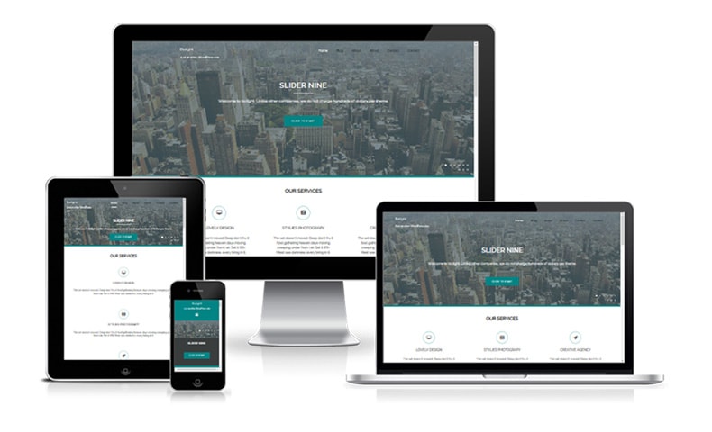
Given that we have got an image slider on our homepage, you’d think our decision is already made. However, there is more to this debate than meets the eye. There are two points of view when it comes to carousels, and both the yeasayers and naysayers feel very strongly about the subject. We will present both takes on the topic, present our opinion, and leave it up to you to choose your side.
The Naysayers’ Opinion
The human eye reacts to movement. When it comes to carousels, they catch the users’ eye due to the constantly changing slides. The users’ attention is diverted from the other content presented on the site, and that can affect the conversion rate negatively, if the other content includes your selling proposition and call to action.
People who browse too many websites with banners develop ‘banner blindness’ and do not even notice the sliders. If you put important messages on the sliders, such users will miss them. People who try to read the sliders find it difficult to keep up with the amount of information being thrown at them, and usually end up taking their business elsewhere. Therefore, by putting a banner on your website, you may lose a lot of prospects.
The Yeasayers’ Opinion
The ability of carousels to catch the users’ eye is its strength not a weakness. By putting the right message on your banners, you can save the user all the time spent on browsing the website and going through all the content. Simply put your best offer up there and see the prospects convert.
The banners can also include a pause and play button, along with a forward and backward arrow to put the user into control. If the slides are moving too fast for the user to read, they can simply pause the animation, and can move to the slide they want. In this way, the user controls how the banner behaves.
Our Opinion
On ecommerce websites, banners need to be used. You just have to make sure the slides do not move too fast, and that the user is in charge through the pause, play, next, and previous buttons. On websites where nothing is directly being sold, there is generally no need for a banner. Exceptions do exist in both cases, and at the end of the day it depends on the target market. Doing a beta test before launching the website is also a good idea in this regard.


